Bivariate Data and Correlation
What is bivariate data?
It means we are dealing with two variables and looking at how they relate together!
In this case, it's the math scores on the 2012 PISA exam and median household income for each country. We want to know specifically if median income (x-variable/independent variable) affects the math score (dependent variable, y).
We can create a scatterplot to look at the relationship between these two factors. Thus, we are looking at the correlation between categorical data. We are specifically looking at linear relationships here. If we think that one variable directly affects another, then we use the equation y = x to depict this. Thus, the following scatterplot shows a linear relationship.
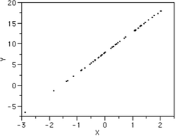
Here, we can see that there are many little black data points. They form a straight line similar to the function y=x. This is what we ideally want to see from our calculator if two factors are strongly related to each other.
So we are testing to see if the math scores and median income have a strong relationship. In order to check this, we look at a coefficient called r. This will be explained more below!
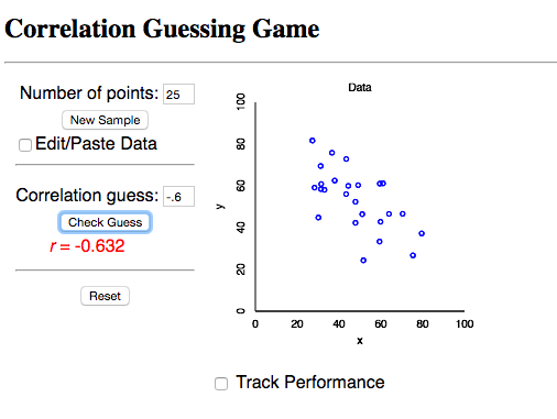
Let's look at an activity to practice correlation. Click here!
The number of points is set at 25, so we will keep this as is.
Click on "New Sample," and look at the scatterplot shown. In the space provided, type in your estimation of the correlation, the r value. Remember, if the y-values decrease as your x-values increase, then the relationship is negative, so you will need a negative sign.
If you want to see your progress, click on "Track Performance."
Here is one example:
So we are testing to see if the math scores and median income have a strong relationship. In order to check this, we look at a coefficient called r. This will be explained more below!
Let's look at an activity to practice correlation. Click here!
The number of points is set at 25, so we will keep this as is.
Click on "New Sample," and look at the scatterplot shown. In the space provided, type in your estimation of the correlation, the r value. Remember, if the y-values decrease as your x-values increase, then the relationship is negative, so you will need a negative sign.
If you want to see your progress, click on "Track Performance."
Here is one example:
Now, let's look at the correlation between our two factors: median income and math score from the PISA test.
First, let's place the math test scores from the PISA exam for all the countries into List 1 in our calculator.
Then, let's place the median household incomes into List 2.
If you're using a TI-83/84 calculator, this can be found by clicking Stat> Edit
After, let's find the Linear Regression between L1 and L2. Click Stat and scroll over to highlight "Calc." Then, choose option 4) LinReg(ax+b) and choose L1 as the XList and L2 as the Ylist.
What is linear regression? (Side note)
When we think of the word linear, we usually associate it with a straight line. If we are comparing two different types of data, we want to know if there is any relationship between them. The 2012 PISA math exam scores and median household income by themselves doesn't give us much information. But what if we looked at the data in relationship to each other. Is there evidence to suggest that one is correlated with the other? Reworded, this means: is there a relationship between these two factors?
In statistics, we can never say that a correlation means that one factor causes another. Thus, it's never appropriate to conclude that median household income causes the math scores from the PISA exam to be higher. We can only say that they are related to each other.
We can test the relationship with the coefficient, r. r conveys the strength of the correlation. We would like |r| = 1. If |r| is closer to 0, then this means the relationship between the two factors is weak, and thus there is very little relationship between them!
What if r is negative?
This means that as one factor goes up, the other one goes down. This could happen if we look at finances. For example, if I continue paying rent for my house, the cumulative rent amount will increase each month, and the amount of money in my bank account will go down. Just from common sense, we know that these two are related to each other because paying rent directly affect the amount of money left in the bank account. Thus, r would most likely be negative but close to 1. Then, we can say that the relationship is strong but negative.
Thus, to just look at the strength of r, we take the absolute value.
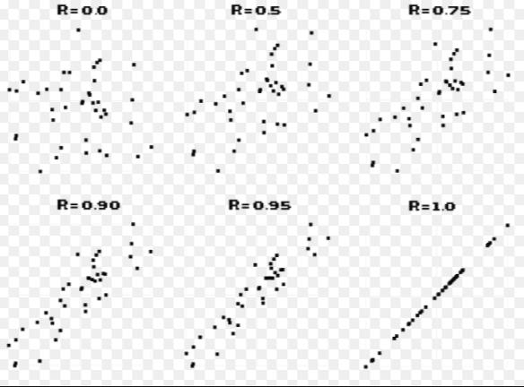
The image below represents different scatterplots with their associated correlation value. We can think of correlation value as our strength test. How strong is the relationship between two categorical variables? Notice the big difference between r = 0 and r = 1.
First, let's place the math test scores from the PISA exam for all the countries into List 1 in our calculator.
Then, let's place the median household incomes into List 2.
If you're using a TI-83/84 calculator, this can be found by clicking Stat> Edit
After, let's find the Linear Regression between L1 and L2. Click Stat and scroll over to highlight "Calc." Then, choose option 4) LinReg(ax+b) and choose L1 as the XList and L2 as the Ylist.
What is linear regression? (Side note)
When we think of the word linear, we usually associate it with a straight line. If we are comparing two different types of data, we want to know if there is any relationship between them. The 2012 PISA math exam scores and median household income by themselves doesn't give us much information. But what if we looked at the data in relationship to each other. Is there evidence to suggest that one is correlated with the other? Reworded, this means: is there a relationship between these two factors?
In statistics, we can never say that a correlation means that one factor causes another. Thus, it's never appropriate to conclude that median household income causes the math scores from the PISA exam to be higher. We can only say that they are related to each other.
We can test the relationship with the coefficient, r. r conveys the strength of the correlation. We would like |r| = 1. If |r| is closer to 0, then this means the relationship between the two factors is weak, and thus there is very little relationship between them!
What if r is negative?
This means that as one factor goes up, the other one goes down. This could happen if we look at finances. For example, if I continue paying rent for my house, the cumulative rent amount will increase each month, and the amount of money in my bank account will go down. Just from common sense, we know that these two are related to each other because paying rent directly affect the amount of money left in the bank account. Thus, r would most likely be negative but close to 1. Then, we can say that the relationship is strong but negative.
Thus, to just look at the strength of r, we take the absolute value.
The image below represents different scatterplots with their associated correlation value. We can think of correlation value as our strength test. How strong is the relationship between two categorical variables? Notice the big difference between r = 0 and r = 1.
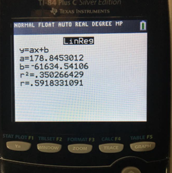
Now, coming back at our research question! If we look at the images below, we can see the output data from the LinReg tool on our calculator.
We see that we have the equation y=ax+b, and our calculator actually gives us a, and b. This means that we could plug in any x-value we want to, and we can get a corresponding y value. Thus, if anyone were to give me a specific median household income, I could tell them the predicted math score associated to that income.
We are also given an r and r^2 value.
As stated before, r is our correlation value. This shows the relationship strength between our two variables: math test score and median household income.
Here, r = .5918 = .6. What does this mean?
First, we see that r is positive. This means that the relationship is also positive. So as median income household goes up, so does the PISA math score. The correlation value is moderately strong since it is above .5. Therefore, we can conclude that the relationship between median household income and math scores from the PISA exam is moderately strong.
The picture below is an output from a TI-84 calculator using the LinReg tool:
Now, let's look at the scatterplot of our data.
We would like to see a strong relationship between our two factors of data. We already know that r is moderately strong, so what would you expect to see from our scatterplot? Would you expect to see a linear trend?
Since r is strong, we should expect to see a linear relationship from our data points. Also, since r is positive, the y-values should increase as the x-values increase.
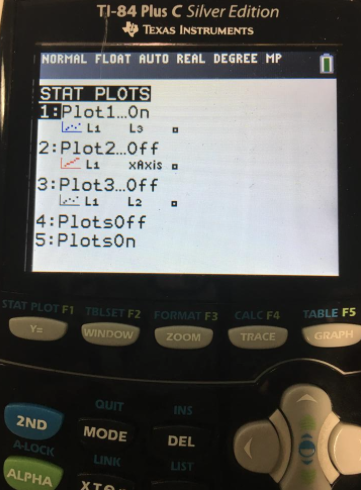
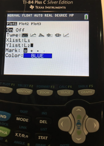
In order to do this, you will have to press the blue "2nd" button on your calculator and then the "y=" button. This will allow you to access the stat plot part of your calculator. Refer to the images below to check that you are doing this correctly!
When you see the first image, click enter when your "mouse" is highlighted on the first stat plots. Then, turn that plot "On" by highlighting over it and pressing enter again. You'll want to scroll over and highlight the first graph because that is the graph for a scatterplot. Then, XList should have L1 and YList will be L2. You can either type this in manually or you can click: "2nd> Stat" and select which list you'd like to use. Then, click on the grey "Zoom" button and select option 9: Zoomstat. This will allow you to look at the scatterplot in the correct window format. Otherwise, your graph won't be correct!
We would like to see a strong relationship between our two factors of data. We already know that r is moderately strong, so what would you expect to see from our scatterplot? Would you expect to see a linear trend?
Since r is strong, we should expect to see a linear relationship from our data points. Also, since r is positive, the y-values should increase as the x-values increase.
In order to do this, you will have to press the blue "2nd" button on your calculator and then the "y=" button. This will allow you to access the stat plot part of your calculator. Refer to the images below to check that you are doing this correctly!
When you see the first image, click enter when your "mouse" is highlighted on the first stat plots. Then, turn that plot "On" by highlighting over it and pressing enter again. You'll want to scroll over and highlight the first graph because that is the graph for a scatterplot. Then, XList should have L1 and YList will be L2. You can either type this in manually or you can click: "2nd> Stat" and select which list you'd like to use. Then, click on the grey "Zoom" button and select option 9: Zoomstat. This will allow you to look at the scatterplot in the correct window format. Otherwise, your graph won't be correct!
|
|

|
From our scatterplot, do you see a linear relationship? That is, if we try to draw a straight line through the data points, could we easily create a straight line?
It seems that we can draw some kind of LSRL since our data points appear somewhat linear. This straight line is called the LSRL or our line best fit. LSRL stands for "Least Squares Regression Line," and it's job is to match the data we have given our calculator. It is the smallest possible value for the sum of the squares of our residuals
(Residual = Observed - Expected for any arbitrary point).
Looking at the scatterplot, there is definitely a positive upward trend. As we saw from our r value, the relationship was not very strong. This scatterplot also supports this investigation of our bivariate data. While we can draw some kind of straight line through the points, there is a good amount of spread. Thus, we can conclude that math scores from the PISA exam and median household income are related, but it is not super strong.
Line of Best Fit:
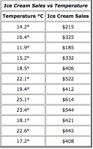
How can we use our TI-Nspire calculator to determine a line of best fit? Let's use the following data on temperature and ice cream sales to test this. We will use this new data set since it is shorter and more simple than the median household income and math scores data set.
First, open a new document in your TI-Nspire Calculator. Click on option 4: Add Lists and Spreadsheets.
Then, type this data into your calculator. Looking at our factors, which one seems to be the independent variable and which ones is the dependent variable? How do you know?
(Answer: Temperature- Independent and Ice Cream Sales Dependent)
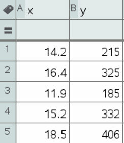
Let's put the data for temperature (C) under column A and data for ice cream sales under column B. Label the columns x and y, respectively.
How can we use our TI-Nspire calculator to determine a line of best fit? Let's use the following data on temperature and ice cream sales to test this. We will use this new data set since it is shorter and more simple than the median household income and math scores data set.
First, open a new document in your TI-Nspire Calculator. Click on option 4: Add Lists and Spreadsheets.
Then, type this data into your calculator. Looking at our factors, which one seems to be the independent variable and which ones is the dependent variable? How do you know?
(Answer: Temperature- Independent and Ice Cream Sales Dependent)
Let's put the data for temperature (C) under column A and data for ice cream sales under column B. Label the columns x and y, respectively.
|
|
Next, click on the "doc" button > 4) Insert > 7) Data and Statistics. This will open a new sheet where you can add variables on the x and y axis. Select what is appropriate and you should be able to create your own scatterplot of the two variables.
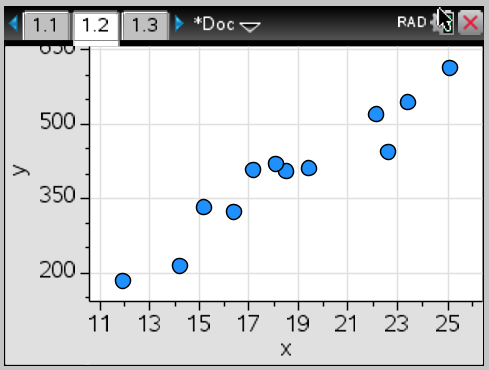
Does this data appear linear to you? What correlation value would you expect to have? Would this value be positive or negative?
The data definitely has some kind of linear relationship. This means the correlation has some moderate strength. We could estimate .6<r<.9, and the relationship appears positive since the y-values increase as the x-values increase.
Now, let's find r.
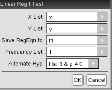
To do this, press the "doc" button again. Select 4) Insert > 3) Calculator. Then, press "menu" and click on 6) Statistics > 7) Stat Tests and choose option A: Linear Reg t Test.
Choose x and y appropriately and save RegEqn to: f1.
Our frequency is 1 and the alternative hypothesis will be left as the default.
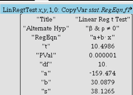
Here is the output:
The data definitely has some kind of linear relationship. This means the correlation has some moderate strength. We could estimate .6<r<.9, and the relationship appears positive since the y-values increase as the x-values increase.
Now, let's find r.
To do this, press the "doc" button again. Select 4) Insert > 3) Calculator. Then, press "menu" and click on 6) Statistics > 7) Stat Tests and choose option A: Linear Reg t Test.
Choose x and y appropriately and save RegEqn to: f1.
Our frequency is 1 and the alternative hypothesis will be left as the default.
Here is the output:
|
|
What is our r value? Can we conclude that the relationship between temperature and ice cream sales is strong?
What is our r-squared value?
Our r-squared value is a statistical measure of how close the data is to the fitted regression line. It's called the coefficient of determination. Our r-squared value is .917. This means that 91.7% of the variation in ice cream sales is explained by the linear relationship between temperature and ice cream sales. In general, we say that r^2 is the % of variation of our y variable explained by our x variable.
Since r is very close to 1, we can conclude that the relationship between temperate and ice cream sales is strong.
Now, let's find the function that best represents this relationship.
Notice in our calculator output that our RegEqn = a + b * x. We are actually given an a and b value if you look lower down.
Then, our f(x) = 30.0879x - 159.474
What does this tell us? This means that if anyone gave us a random temperature, we could plug this in as our x value and find a corresponding y value, the expected amount of money from selling ice cream for that specific temperature.
-159.474 is our y - intercept. It's the amount of ice cream sales we'd expect if our temperature were x = 0. Does this make sense though? Can we make a negative amount of money? In this case, we can interpret this as spending money on supplies to make ice cream, but we didn't actually earn anything. Thus, we are in debt. *In some cases, having a negative y-intercept may not make sense. For instance, consider heights of a human being. Height cannot be negative.
30.0879 represents our slope, or change in y for every increase in x. We also call this marginal change. This means that for every temperature increase, our ice cream sales should increase by $30.0879. Don't forget units! Many of the numbers in statistics won't make sense unless it's in context.
Also notice that s=$38.1265. This is our standard error. The standard error tells us that the typical difference between the observed and expected value by the LSRL. It is better when our standard error is smaller because it means that our prediction is more accurate. If the relationship is stronger, then the LSRL will define our data points better. Thus, the discrepancy between the observed and expected values is smaller.
In context, we can say that the typical discrepancy between observed and expected ice cream sales is $38.13. We round up to make sure our value makes sense in context.
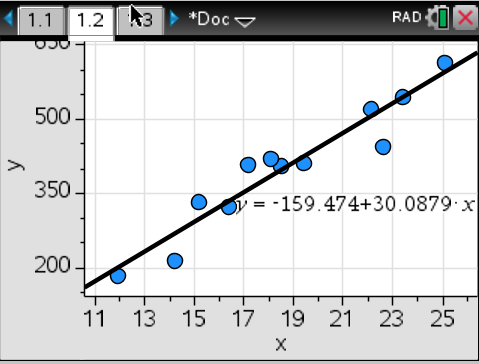
Now, let's actually add a regression line to our scatterplot. To do this, first go to the screen that has your scatterplot on it. Then, click on "menu" and select 4) Analyze > 6) Regression > 2) Show Linear (a+bx)
This shows a black line that best fits our data. It also shows the specific equation that is related to our data that allows us to plug in x values as an input. As you may intuitively realize, the stronger our data is, the better the LSRL does at estimating a specific y-value.
What is our r-squared value?
Our r-squared value is a statistical measure of how close the data is to the fitted regression line. It's called the coefficient of determination. Our r-squared value is .917. This means that 91.7% of the variation in ice cream sales is explained by the linear relationship between temperature and ice cream sales. In general, we say that r^2 is the % of variation of our y variable explained by our x variable.
Since r is very close to 1, we can conclude that the relationship between temperate and ice cream sales is strong.
Now, let's find the function that best represents this relationship.
Notice in our calculator output that our RegEqn = a + b * x. We are actually given an a and b value if you look lower down.
Then, our f(x) = 30.0879x - 159.474
What does this tell us? This means that if anyone gave us a random temperature, we could plug this in as our x value and find a corresponding y value, the expected amount of money from selling ice cream for that specific temperature.
-159.474 is our y - intercept. It's the amount of ice cream sales we'd expect if our temperature were x = 0. Does this make sense though? Can we make a negative amount of money? In this case, we can interpret this as spending money on supplies to make ice cream, but we didn't actually earn anything. Thus, we are in debt. *In some cases, having a negative y-intercept may not make sense. For instance, consider heights of a human being. Height cannot be negative.
30.0879 represents our slope, or change in y for every increase in x. We also call this marginal change. This means that for every temperature increase, our ice cream sales should increase by $30.0879. Don't forget units! Many of the numbers in statistics won't make sense unless it's in context.
Also notice that s=$38.1265. This is our standard error. The standard error tells us that the typical difference between the observed and expected value by the LSRL. It is better when our standard error is smaller because it means that our prediction is more accurate. If the relationship is stronger, then the LSRL will define our data points better. Thus, the discrepancy between the observed and expected values is smaller.
In context, we can say that the typical discrepancy between observed and expected ice cream sales is $38.13. We round up to make sure our value makes sense in context.
Now, let's actually add a regression line to our scatterplot. To do this, first go to the screen that has your scatterplot on it. Then, click on "menu" and select 4) Analyze > 6) Regression > 2) Show Linear (a+bx)
This shows a black line that best fits our data. It also shows the specific equation that is related to our data that allows us to plug in x values as an input. As you may intuitively realize, the stronger our data is, the better the LSRL does at estimating a specific y-value.
Conclusion:
Keep in mind that a large part of statistics is interpretation. Thus, each statistician will interpret data differently. It seems that the data for our original research question on median income and math score is more linear since it resembles the function y=x more explicitly. However, it's clear that drawing a line through all the points would still be difficult to do. Thus, we can conclude that the two categorical factors are not strongly related to one another.
If you're ready for our first inference test, click here.
