Statistics Crash Course
If you've never taken a statistics course before, have no fear! We are going to walk through basic definitions and concepts before jumping into our research question.
First, let's start with the basic definition of statistics from Google. It is "the practice or science of collecting and analyzing numerical data in large quantities, especially for the purpose of inferring proportions in a whole from those in a representative sample."
("Define Statistics." Google. Google, n.d. Web. 31 Oct. 2016.)
This means if we want to make some conclusion about a population, we can take a sample of appropriate size from the population, do some statistical tests on it, and reach a conclusion on that sample that speaks for the entire population.
What is a statistic?
A statistic is a piece of data taken from a large group.
Think of the population of Virginia Tech. It has roughly 30,000 students including graduate students. That's a lot! If we wanted to find out which of the dining halls each of the 30,000 student prefer to eat at, that wold take a long time. Also, how would I ensure that I can talk to 30,000 students in a small time frame if I needed the information in let's say, a week? I could send out a poll by email, but this doesn't guarantee everyone will answer in adequate time, and some people may just delete the email and not respond.
So instead, we take a sample of students from the 30,000. Let's say I ask 1,000 of them. I could randomly choose 1,000 students and ask each of them which dining hall is his or her favorite. The information I receive from them is the statistic.
The parameter is the population, or whole group, in question: Virginia Tech students
My sample is the 1,000 students that I chose for my study.
One statistic could be that 30% of the 1,000 students prefer eating at West End. After all, have you tried their burgers before?

Mean, Median and Mode
I'm sure you've heard of these words before, but let's discuss what they are!
Mean- This is our average. Let's say we are looking at test scores. The mean test score is found by adding all the scores together and dividing by the number of tests we are considering. In general, we find the sum of our observations and then divide by how many observations we have .
This value is not very robust which means that if we have some extreme values, the average is easily affected. For example, if one student is struggling gets an F, s/he will bring down the average if most students receive an A and or B. Thus, it's best to rely on the median.
Median- This is the data point that directly cuts all of our data points in half. Therefore, 50% of the data points lie below the median and 50% are above it.
The median is more robust. Extreme values don't easily affect the median, so if a student were to get an F on a test, it wouldn't affect this value too much.
Mode- This is the data point that occurs the most often.
Here is an activity that helps us understand median and mode better. It allows us to look at 10 different data points, each a different color, along a number line. Let's look at the following picture below to see an example:
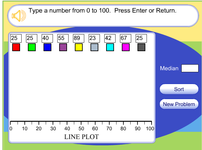
If we type in these data pints (above), then what do you think will happen once we click "enter"? The activity tells us the median, but how would you find the mode?
Notice that if you click the "sort" button then the numbers rearrange so that they follow from lowest to highest. This allows us to find the median data point (yellow box). Play with this activity a little and plug in different data points.
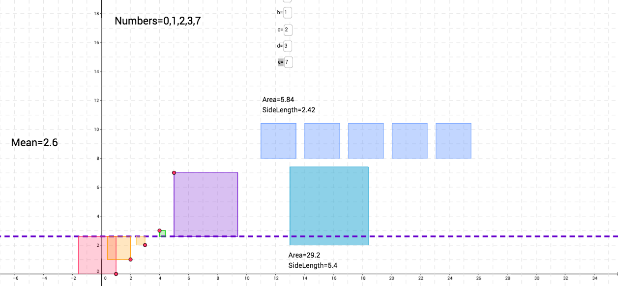
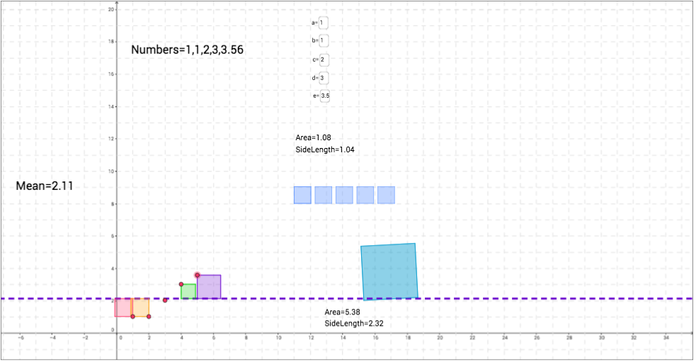
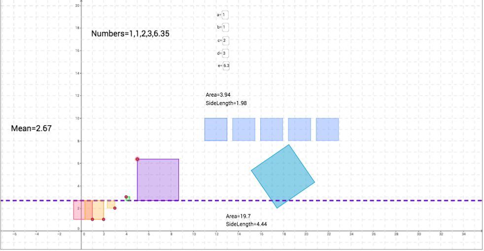
Now, let's investigate the mean a little. Click here for the activity. We see that we have 5 different variables, a, b, c, d, and e. Each of these has a certain value that we can control. For now, leave them at their default value. What is the mean currently? Try calculating this by hand. Do you receive the same result? Now, change e=7 and see what happens to the dashed purple line. Does it change at all? If so, how does it, and why do you think it does?
Now, try changing one of the other variables equal to 7. How would this affect the mean? What happens if we made all the numbers equal to 7. What can we expect the average to be then? What's neat about this activity is that each variable represents a square on the xy-plane whose size is represented by the value of the variable. This helps us visualize the mean and why it is a specific value.
Notice that if you click the "sort" button then the numbers rearrange so that they follow from lowest to highest. This allows us to find the median data point (yellow box). Play with this activity a little and plug in different data points.
Now, let's investigate the mean a little. Click here for the activity. We see that we have 5 different variables, a, b, c, d, and e. Each of these has a certain value that we can control. For now, leave them at their default value. What is the mean currently? Try calculating this by hand. Do you receive the same result? Now, change e=7 and see what happens to the dashed purple line. Does it change at all? If so, how does it, and why do you think it does?
Now, try changing one of the other variables equal to 7. How would this affect the mean? What happens if we made all the numbers equal to 7. What can we expect the average to be then? What's neat about this activity is that each variable represents a square on the xy-plane whose size is represented by the value of the variable. This helps us visualize the mean and why it is a specific value.
|
|
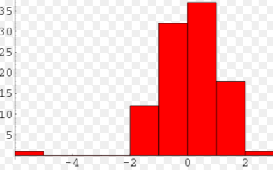
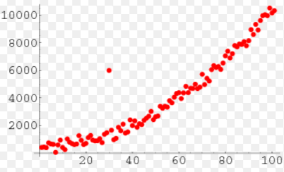
One conceptual idea I want to go over are unique points. This includes gaps, clusters and outliers. And they are just as they sound! Take the picture on the bottom left. While we have some sort of distribution from this histogram, there is clearly a "gap" between -4 < x < -2. While this is not necessarily a bad thing, it's just something to make note of when analyzing data. On the right side, we have an example of an outlier. Most of the data points form close to a straight line except for one observation. Its heigh is much higher than the others, so we'd call this point an outlier. It can affect the average of our data and much more in statistical testing. Sometimes, statisticians will actually remove the outlier to perform their inference tests.
|
|
By pinpointing any unusual figures, we can pay special attention to whether or not these are problem spots when doing hypothesis tests.
Standard Deviation and Variance:
We've discussed what the mean is, but what is standard deviation and variance?
Standard Deviation: A measure of the amount of variation between a set of data values.
Variance: The squared standard deviation. It is the expectation of the squared deviation of a variable from its mean. It measures how far the set of data points are spread out from the mean.
Does this sound confusing? It should because without any context, this can be very vague! In statistics, we will have many data points in a study. When we find the average, we can compare each individual data point to the average and see how far away it is. This gives us a meaning of "spread." How spread out are our data points? And depending on what we're analyzing, we may not want our data points to be super far away from each other.
To understand standard deviation and spread, let's work with the GeoGebra activity that we looked at a few minutes ago. Here it is again.
Let's say we are looking at the number of cookies people eat for dessert, and a, b, c, d, and e represent five different people. So person a eats 0 cookies, person b eats 1 cookie and so on.
Without changing the variables, we see that the mean is 2 cookies. Thus, the purple dashed line is at y=2. Each square represents one person, and the edge of the square farthest from the purple line represents how far away that value is from the mean. This is our idea of "spread." How spread out is each observation from the mean? We can think of the mean as how many cookies a person should eat. Thus, if a person, say John, eats 5 cookies, he is eating way more than Sarah, who let's say eats 3 cookies. Sarah is only 1 cookie away from the mean while John is 3 cookies away from the mean (2 cookies). Thus, his "spread" is larger than Sarah's.
To see this visually, click on little red circle on the purple square and make the square larger. When we do this, what do you notice about the mean? What is also happening to the size of the other squares? Why do you think this is?
Let's focus on the green square. As we made the purple square larger, this means that our mean increases (Note the difference between the two means). Can we say that the spread of the purple square increased? How so? If this is the case, what can we say about the spread of the green square? What's the size difference between the picture on the left compared to the picture on the right?
|
|
Types of graphs:
Histogram: This graph is used for quantitative data. The bars usually touch and the x-axis breaks up the range into equal intervals of our x value.
Bar graph: This is used for categorical data. The bars usually are not touching and are separated by a space.
Pie chart: This allows us to break data into percentages and look at everything as a piece of 100%
Types of Tests:
We use different tests to explain the significance of our data.
Hypothesis tests: This test allows us to create a null hypothesis and test whether we can reject or accept it depending on if its probability falls below a specific significance level, alpha. This test allows us to state that the hypothesis being tested has that level of significance.
Chi-Squared Test: There are two types: Goodness of Fit and a Test of Independence. For our research question, we will be using a Test of Independence to see if two categorical factors are related to each other in anyway.
Important Theorems:
Central Limit Theorem: This theorem states that as we take larger and larger sample sizes, our data becomes more and more normal. Why is this? Consider flipping a coin. We know that at the first attempt, the chances of getting heads is 50% and the chances of getting tails is 50%. Let's say after our first flip, we get heads. Now, let's flip the coin again. What are the chances of getting heads and tails?
The answer is still the same: 50-50. Why? Why are we not more likely to get heads since we got heads earlier?
Now consider the following outcome:
1) Heads
2) Heads
3) Tails
4) Heads
5) Tails
What is the likelihood of flipping heads the 6th time?
Again, it's still 50%
We can better visualize this from the following website:
At the top where the graph is, change the following settings as such:

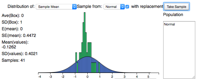
Now, click on "Take Sample." Continue clicking on this button. What do you notice about the distribution? How does it first start out and how does it change? What conclusions can we say about this sample? Is it normal or skewed? How do you know and why does this matter?
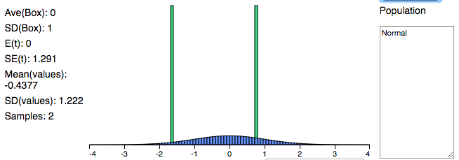
The picture on the left (below) shows what the distribution looks like once we've taken 41 samples. Does it look approximately normal? Let's compare this with a distribution where we've taken less than 10 samples, a relatively small number. On the right we have a distribution after taking 2 samples. Now, I've chosen for both distributions to be normal, so we know both of them are by default, but what's the difference in the shape of these bell curves? Why do they look different?
The picture on the left (below) shows what the distribution looks like once we've taken 41 samples. Does it look approximately normal? Let's compare this with a distribution where we've taken less than 10 samples, a relatively small number. On the right we have a distribution after taking 2 samples. Now, I've chosen for both distributions to be normal, so we know both of them are by default, but what's the difference in the shape of these bell curves? Why do they look different?
|
|
We know that the CLT applies here. Thus, as we take more and more samples (our sample size grows larger), then our distribution becomes more normal.
Standardizing Values:
We will be performing various statistical tests later on this website, so it's important to understand how to find a test statistic. Let's consider a simple example. Say we have a normal distribution of the number of students who attend Virginia Tech football games. The average is 15,000 students and the standard deviation is 3,000 students. Then what is the likelihood that 23,000 students attend the game against UVA in two weeks? To find this value, we rely on the z-statistic to find this.
We use this formula:
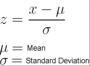
Using this formula, go ahead and find the z-statistic.
(23,000 - 15,000) / 3,000 = 2.6667
We then use a normal bell curve to find the probability of obtaining this test statistic. Below is a picture of the normal bell curve. Notice that the mean, or mu, is 0, and each standard deviation is a value of 1. We can label this normal distribution as (0, 1).
Now, plot the z-statistic of 2.6667. This will be somewhere between 2 and 3, closer to 3. We can eyeball this; it doesn't have to be perfect! Now, we want to find the likelihood of obtaining a value up to 2.6667. Thus, we can shade from this point all the way to the left.
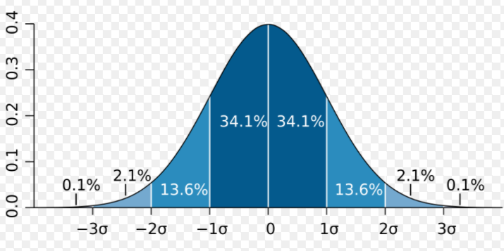
To find the actual percentage, we rely on our calculator. You can use any TI-83/84. Click on "2nd vars" and select option 2: normalcdf. This allows us to find the cumulative area between two bounded regions.
Our lower can be some large negative number. We could type in -999 or -1E99. Our upper bound is the z-stat we found: 2.6667. u = 0 and sigma = 1
What percentage did you receive?
From my output, I found that the percentage is 99.6%. This means that there is a 99.6% change of having a football game containing 23,000 Virginia Tech students at the next football game against UVA.
Now that we have some basic understanding of statistics, let's move on to learning about the PISA test. Click here.
