Visualization with Tinkerplots
Statistics always starts with lots of data, but organizing it efficiently and being able to categorize and make sense of it can be tricky. Let's look at some graphs first to see how all these countries compare. To better visualize the data we have, we will begin with Tinkerplots. This application allows us to use colors and fun shapes to best understand data graphically. We can look at trends and general concepts about the GDP and how well countries do on the PISA test.
The following graph shows each of the 50 countries in the study and their corresponding math score from the PISA exam:
The following graph shows each of the 50 countries in the study and their corresponding math score from the PISA exam:
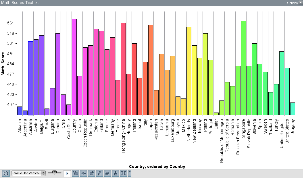
Here, the countries are listed in alphabetical order. We can see the score a country's average math score on the left side (y-axis) and look at the corresponding country on the bottom. We have a lot of countries right now, so this isn't very helpful. Let's look at what happens if we add a third category where we split each country into either Group A or Group B based on their gross median income from 2012.
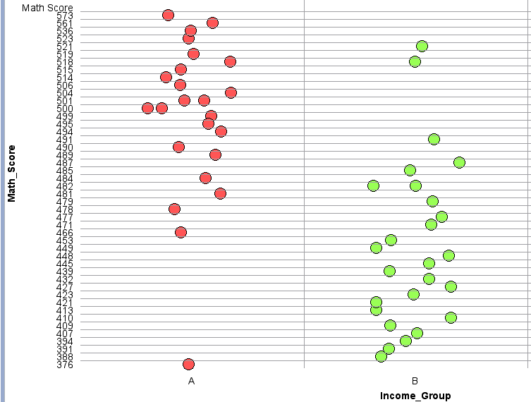
The drawback to this graph is that we can't see which point is which country. However, we can easily click on a specific point and use the table to gather quick information about which country the point is referring to, the average math score, and which group it's in (which we can see from this graph easily). I've broken the two income groups into two different colors, red and green. Group A (red) refers to the countries with higher gross median household incomes and Group B (green) contains the countries with the lower half gross median household incomes.
What do you notice in general about the test scores between these groups? Do you notice anything particular about how well Group A did overall in comparison to Group B?
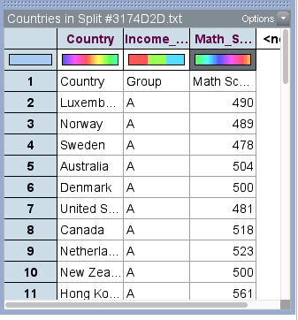
The picture below is the table you will see in Tinkerplots. It allows us to look at a single observation more closely. By clicking on a point in our graph, we are able to receive quick information about it.
What do you notice in general about the test scores between these groups? Do you notice anything particular about how well Group A did overall in comparison to Group B?
The picture below is the table you will see in Tinkerplots. It allows us to look at a single observation more closely. By clicking on a point in our graph, we are able to receive quick information about it.
Now that we've looked at average math scores, let's look a little at standard error.
Here's a Tinkerplot graph of the standard error of the countries in general:
Here's a Tinkerplot graph of the standard error of the countries in general:
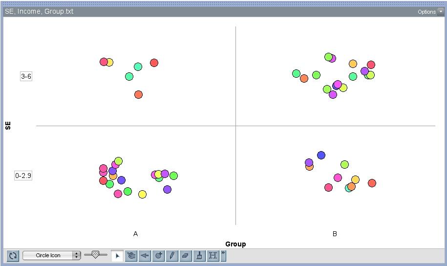
What we're looking for again is to see if there is some significant relationship between a country's gross median household income in 2012 and how well its 15 year old students to on the PISA exam in the math section. What we'd like idealistically is that every 15 year old does well on the test. This would mean they are receiving sufficient education regardless of their family is doing economically. Thus, we'd like to have a small standard error. This means the spread of the math scores would be small. Reworded, this means students from different countries test similarly.
However, looking at the Tinkerplot graph of the standard errors between Group A and Group B, what do you notice in general? Since we aren't doing any inference tests yet, we can generalize freely to make a hypothesis for our tests. The tests will do the number crunching to make sure our "guess" is accurate.
As you may have noticed, Group A's countries mostly have a smaller standard error between 0-2.9 while countries in Group B are more split. There's more data points that have a standard error of 3-6. Is this concerning? What does this mean about how median income affects PISA test scores in the math area?
More importantly, why do we care?
Since group A's spread is smaller, this means that the average math score for most of these countries were similar to each other. Thus, the students tended to have the same level of math skills. Group B on the other hand contains countries with a lower median income. The average maths scores for these countries is more varied. Some countries may have done well, and some may have done poorly. There is more of a difference in math scores for these countries.
Why might this be?
Let's look at how this data relates to one another. Click here!
